FIG. 02.4 — Project notes
- Independent
- Finished
OncoLens: Explainable Tumor Classification Dashboard
A recall-first, explainable tumor classifier with an interactive Streamlit dashboard, built on the public Wisconsin Diagnostic Breast Cancer dataset.
Educational only — not a clinical tool
Built for learning on public data. It is not a medical device and must not be used for diagnosis.
- Test recall at t = 0.2
- 0.976 (41/42)
- Test ROC AUC
- 0.996
- Nested-CV ROC AUC
- 0.9949 ± 0.0051
- Tests
- 48 pytest
01Problem
In cancer screening, a missed malignant case costs more than a false alarm.
02Question
Can a transparent model be tuned to favor catching malignant cases — and explain each prediction?
03Data
UCI Wisconsin Diagnostic Breast Cancer dataset, loaded via scikit-learn: 569 samples, 30 features describing cell nuclei from digitized fine-needle aspirate images (212 malignant / 357 benign).
04Methods
- Stratified 80/20 split (455 train / 114 test); the test set was used once.
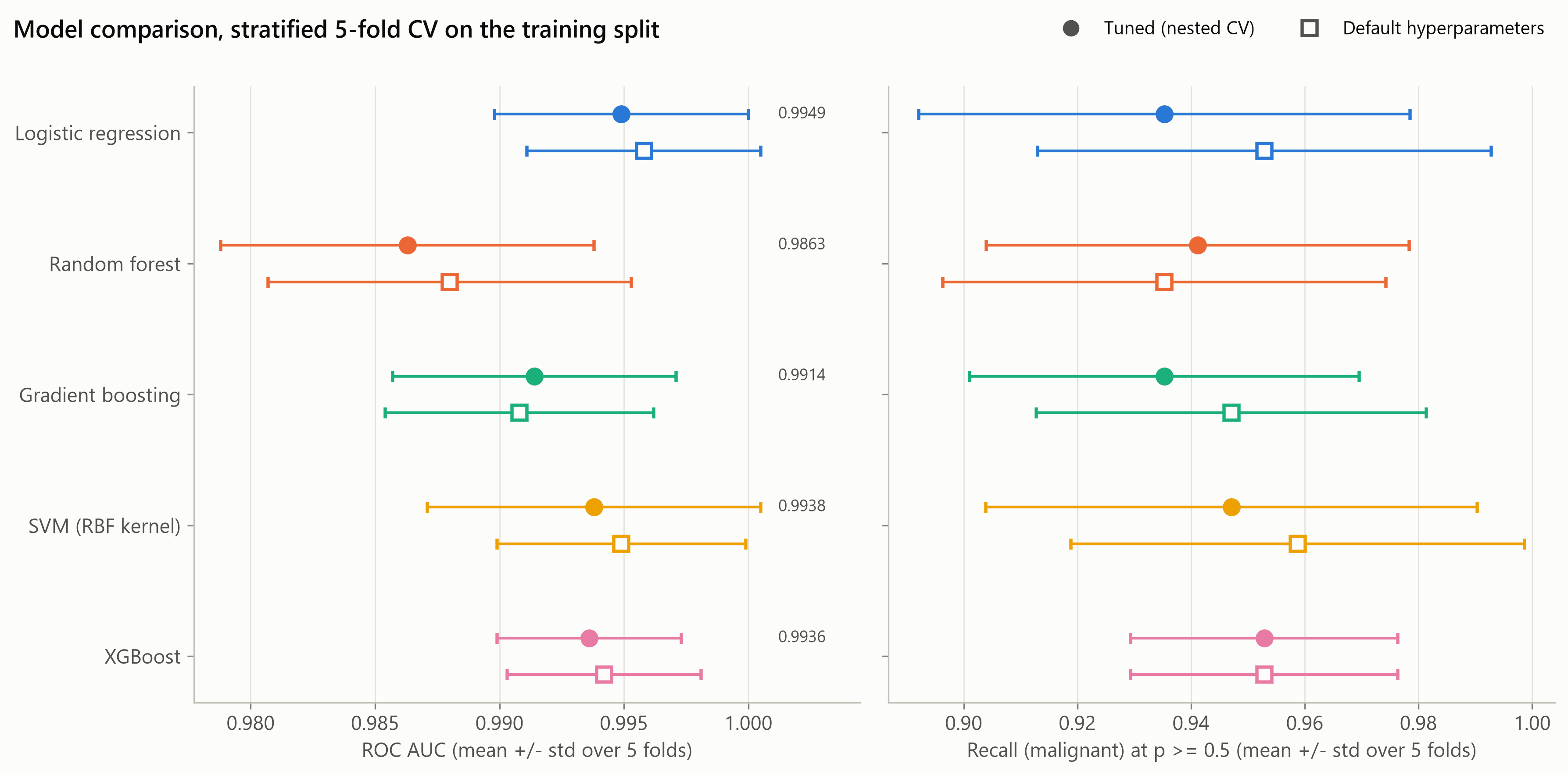
- Five models — logistic regression, random forest, gradient boosting, RBF SVM and XGBoost — tuned with GridSearchCV and compared by nested cross-validation.
- Scaling inside every cross-validation pipeline, so nothing leaks from validation folds.
- Calibration check (Brier score, expected calibration error).
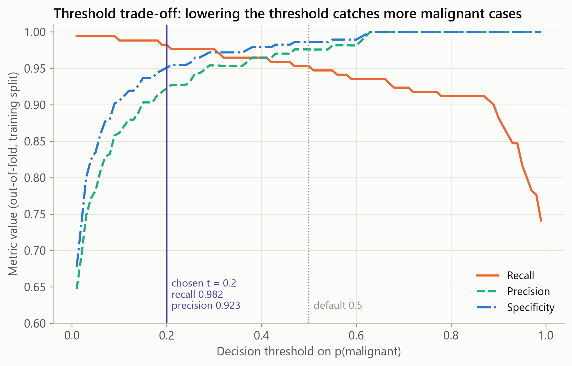
- Recall-first decision threshold chosen from out-of-fold training predictions: the highest threshold with out-of-fold recall ≥ 0.98, which gave 0.2.
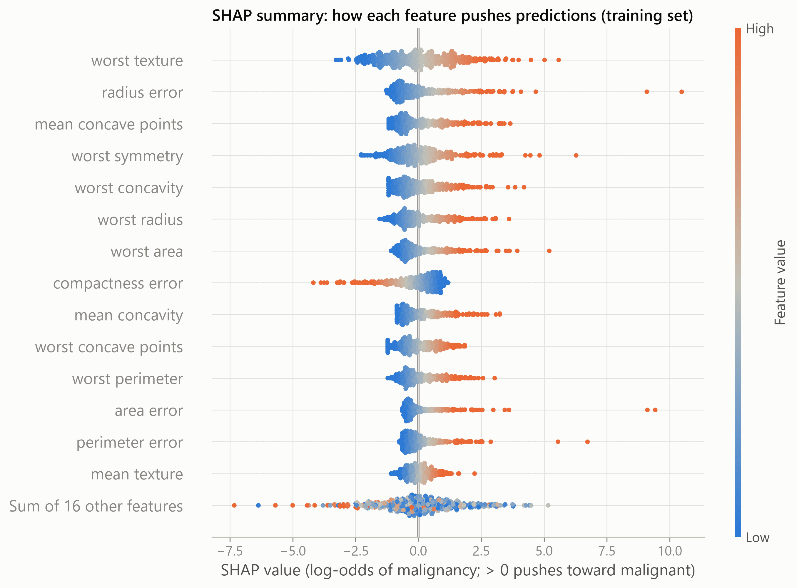
- Exact SHAP explanations (LinearExplainer), both global and per patient.
- Error analysis of the remaining mistakes.
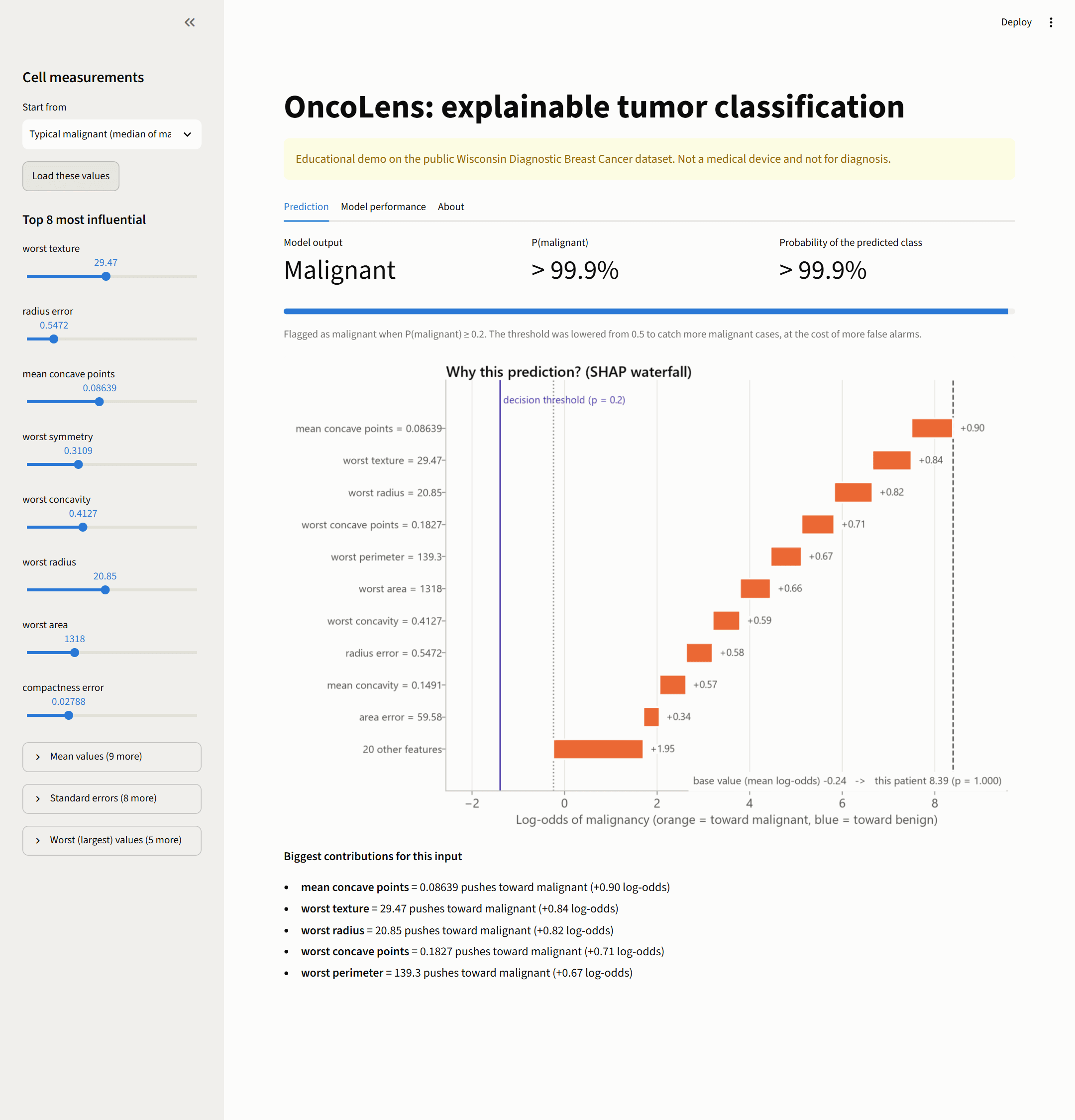
- A Streamlit app for interactive predictions and explanations.
- 48 pytest tests with continuous integration.
05Tools
- Python
- scikit-learn
- XGBoost
- SHAP
- Streamlit
- pytest
- Docker
06Visualizations
07Findings
- Logistic regression was chosen (nested-CV ROC AUC 0.9949 ± 0.0051). All five models were close (0.986–0.995); the differences were within fold-to-fold variation.
- Held-out test set (114 samples, 42 malignant), threshold 0.5: recall 0.929 (39/42), accuracy 0.965, ROC AUC 0.996.
- At the chosen threshold of 0.2: recall 0.976 (41/42), precision 0.911, specificity 0.944, accuracy 0.956.
- Missed malignant cases fell from 3 to 1, at the cost of 3 extra false alarms.
08Limitations
- Not a clinical tool — educational only.
- Small, old, single-institution dataset (early 1990s).
- Uses pre-computed features, not raw images.
- Small test set: one case equals 2.4 points of recall.
- The recall target behind the threshold is a value judgment, not one set by clinicians.
- SHAP explains the model, not the biology.